Posts in Category: Blog
My hate/love for code
Yesterday I made a brand new website from scratch. I built it in a subdomain to the root without any indexing from Google, built a nice little structure and trying out some things. This afternoon I was ready to replace the whole root catalogue with my subdomains. But instead, I deleted my work-in-progress in the process. No backup, no cache, no files on my computer. Did I mention it was for work? Insert gun emoji.
Dedicated x Smiley

Perks about working with an awesome brand: getting to sell (and buy) this awesome t-shirt. I’m obviously happy about it.
Saying goodbye to a job
This week I’ve been cleaning out my office (literally) and also my Dropbox, computer etc. All there’s left now: the Photobooth library. Maybe I should just leave it for whoever takes my place? Hello and goodbye *insert dramatic emoji*.
SEO Q&A by Practical E-commerce
Practical E-commerce just posted an article and Q&A for Google’s new algorithm, including what you can do between now and April 21. Read their full post here!
New design
I’m struggling a bit with a new design for this theme, trying out some different things etc. You know when there are so many things you could do that it’s overwhelming? Bare with me, please.
New Google-algorithm: Mobile-friendly
This spring, Google will start to favor mobile-friendly websites directly in the search results. Meaning having a responsive web design is not only a necessity for your on-page experience (i.e: conversion rates) but the organic search traffic on mobile devices. So – make sure to read and implement Google’s Mobile Optimization Guidelines (if you’re not sure – they have an excellent testing tool).
On April 21, this new ranking algorithm will start affecting the order of search results directly. And in Google’s words, the change will have a “significant impact” on search results for mobile searchers. How this will affect your e-commerce business depends on what this “significant impact may be, and what your mobile search performance is today. For some, resolving these issues could be a really simple while others may need to do a total re-design.
Now is the same if any to re-evaluate your brand’s online presence, to implement a cross-channel and device strategy.
Inspiring e-commerce – Glossier
I continuously (and thoroughly) browse the internet for inspiration. Not just for fun or to kill time, but for work too. Right now for example I am looking for nice designs for an upcoming project and this brand continues to impress me. What I like the most is: their imagery, how they display their products, the typography and that they incorporate emojis in their online copy. They have great content that is both valuable and likeable for me as a potential customer. They make me wanna buy beauty products, something that I have absolutely no interest nor knowledge in what so ever. Kudos! Needless to say, this comes across on all platforms.
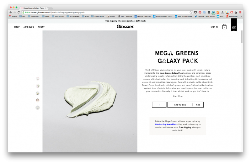
Their USP, being “girl-powered” and re-thinking beauty really comes across. And I do love girl-power, pastel color palettes and cute online copy.
#TBT Los Angeles
I started this year with a quick little visit to Los Angeles and although Stockholm is pretty nice at the moment I can’t help but miss this: palm trees, beaches, sun sets and no filter what so ever.


Tools I use (and love)
There are a few online tools/apps that I have come to adore and use every single day. This is my top three that I use both at work and at home:
1. Pocket. Browser plugin that lets you tag links online with just one click. To collect, read and sort articles any way you see fit. Connects with your Google account and can be used with web interface, plugin or app.
2. Feedly. Blogs aren’t dead quite yet. Collect, sort, read your best kept rss feeds here.
3. Timehop. An app-based time capsule that connects to your social accounts and summarizes what you posted on the same date, way back. I was late with this because I’m way too nostalgic as it is, but hey – if you’ve been online the past ten years this is pretty funny. I almost wish that I kept my anonymous Twitter account (deleted and ungooglable, just a well-hidden xml-file and comedy goldmine, I pressume).
New job!
The other day I officially announced that I am leaving Mini Rodini after four fantastic years. I’ve been part of this brand almost since the beginning and it’s a bit heart-felt leaving just now, because I know that Mini Rodini is heading towards world-dominiation. And this might sound corny but I will always love Mini Rodini – the brand, the products and my inspiring, bad-ass boss. But with that being said, it is time for me to do something new and in a month I will be T-shirt Store’s Web Manager and I’m really, really excited about that to.
Launching a responsive web
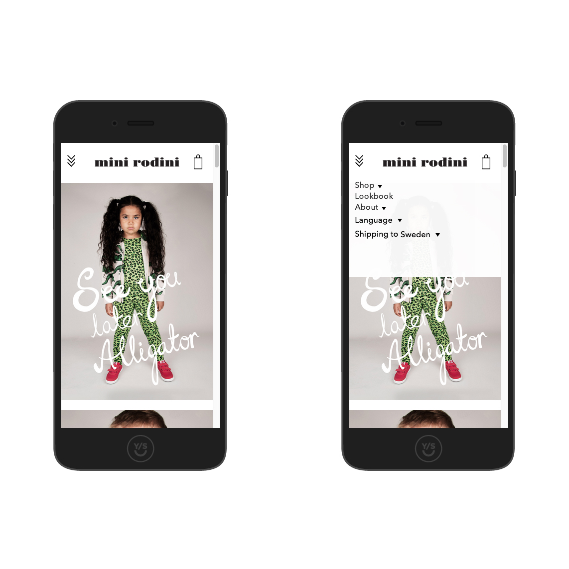 We all already know why you have to “go mobile” if you have a company website, especially if you’re selling goods online. Or else your customers will be browsing and buying elsewhere. It’s 2015 and it’s a fact. But going mobile (or better – responsive) is not a very easy process. It takes time, a lot of expertise and patience. Last year I launched a fully responsive website with Mini Rodini – a fun but sometimes very frustrating project. Here’s a few things I learned:
1. Just do it. Make the time, money and effort – the time is now etc.
2. Know what your designing for and do your research. There are reasons for why responsive designs look a certain way, don’t think too much out of the box. Less is more and you’ll see why when you go live.
3. As with all digital projects – know your metrics and follow them closely. The joy of the digital era is that we can measure everything. Use Google Analytics reports, shortcuts, event tracking and goals and make sure what you can expect. If you don’t know how to, don’t do it at all.
4. Test everything. Everything.
5. Do not plan a vacation two weeks after the very last deadline. No matter how good of a project leader you think you are, you will never be fully ready to launch. And you might end up working from a bar and then a taxi at four in the morning.
6. You will never be ready. You ave to evaluate and re-evaluate. If/when you are, it’s time to change it again.